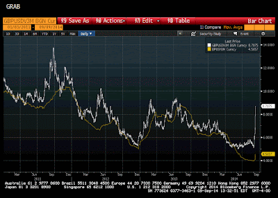
This Great Graphic was created on Bloomberg. It shows the jump in the three-month implied volatility (white line). It bottomed in mid-July near 4.75%.
By the end of August, it was testing 6.0%. Since the ECB's rate cuts and announcement of an ABS/covered bond purchases scheme (without any meaningful details), the implied volatility has jumped higher. It is near 7.5% presently.
When we reviewed sterling volatility, the jump in implied volatility seemed to reflect the demand for option protection. Sterling's vol curve is inverted, with the short-dated implied volatility higher than the longer-dates. The euro vol curve is flatter in contrast. This, coupled with the fact that the euro and implied vol are the most inversely correlated since 2012, suggests that the increase in implied euro volatility is an expression of the bearishness.
The demand for euro puts is evident in the pricing of the risk-reversals. First, it is notable that puts have been at a premium to calls since late-2009. Second, in late-August the premium for puts narrowed to about 0.55%, which the lower end of this year's range. Earlier today, the premium rose to more than 0.90%, which is the most since early February.
Historic volatility (yellow line) remains very low. Excluding the brief period in late August and early September, historic volatility remains near record lows. The gap between the implied and historic volatility is large but not unprecedented. The gap was larger, for example, in the middle of 2012. However, there does not seem to be a compelling pattern of converge after a large gap. Sometimes the historic has risen and sometime the actual has fallen.
Great Graphic: Euro Historic and Implied Volatility
 Reviewed by Marc Chandler
on
September 10, 2014
Rating:
 Reviewed by Marc Chandler
on
September 10, 2014
Rating:


